Congratulations on your new theme! We hope that you will be satisfied with the new addition to your store. Our team remains at your service. You can contact us anytime through our Contact form.
We also invite you to read the documentation of the theme you have purchased. The documentation contains a lot of useful information that will help you make this theme uniquely yours.
Getting Started
Off we go! To the stars and beyond! Milky Way Studios welcomes you onboard. Before we depart, if you are not yet acquainted with the Shopify platform, we recommend reading through the official Shopify documentation. You can find the docs here.
Already selling on Shopify? Awesome! Let's move on to the Setup Guide.
Setting Up
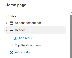
Main Menu Navigation Setup
In order to set up your top bar navigation follow the steps described below:- Open your store's admin panel.
- Open the Content tab in the sidebar menu.
- Click on the option Menus in the dropdown menu.
- Choose one of the preset menu options or create a new one by clicking the Create menu button on the top right side.
- Open your store's admin panel
- Inside the sidebar click on Products to unfold the dropdown menu. If your menu is already unfolded, skip this step.
- In the Products submenu, click on Collections
- Choose the collection you want to edit.
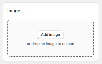
- Click on the Add image field to add an image that will be displayed in the menu.
Header Settings
To start editing your header, you will need to do the following:
- Open your store's admin panel
- Inside the sidebar click on Online Store
- Click on the button Customize on the right-hand side of the Nebula theme panel.
- In the theme customizer, either click on Header in the sidebar or click directly on the header in the preview window.
Note: if you want to open the section settings by clicking directly on the section, make sure the
inspector is activated. The icon will be colored blue when the inspector is active.
Customize the header to your liking using the variety of possible settings combination offered by Nebula theme. Add social media links by clicking on the theme settings dropdown menu inside the header settings.
Once you are satisfied with the changes, save your draft by clicking on the save button in the right top corner or pressing CTRL S (on Windows) or Command S (on Mac).
Setting the Store Logo
To set your own logo in your Shopify store, navigate to the theme settings by clicking on the cogwheel icon in the sidebar. Click on the Logo setting and upload your store's logo and favicon. Favicon is the small icon that will be displayed next to your store's link in a browser tab.
Footer Setting
To start editing your footer, you will need to do the following:
- Open your store's admin panel
- Inside the sidebar click on Online Store
- Click on the button Customize on the right-hand side of the Nebula theme panel.
- In the theme customizer, either click on Footer in the sidebar or click directly on the footer in the preview window.
Note: if you want to open the section settings by clicking directly on the section, make sure the
inspector is activated. The icon will be colored blue when the inspector is active.
Change the color scheme of your footer by choosing one of the color schemes available or create your own . You can enable or disable the following options: Email Signup, Follow on Shop, Social media icons, Country/region selector, Language selector, Payment methods, Policy links, Spacing and Section padding. In order to display the social media icons, country/region, language, and payment methods, you need to configure these options in your store.
In order to find out more visit one of the following links:
Once you are satisfied with the changes, save your draft by clicking on the save button in the right top corner or pressing CTRL S (on Windows) or Command S (on Mac).
Setting a Hero Banner
The first thing your customers will see when they visit your website is your hero banner. Therefore it is important to choose an image or a video that highlights your store and your products. You can use it to inform your customers about promotions and new launches.
Nebula theme ships with three hero banners: Image banner, Video banner, and Slideshow banner.
To add a hero banner, refer to the instructions on how to add a section.
For the image banner you have the possibility to add two images. Each image includes its
own link,
a heading and a
subtitle, as well as a customizable overlay with the possibility to adjust the color and opacity of the
overlay. You can also adjust the background image position to display it optimally for your needs. This
section has arrow icons set by default. These icons can be replaced by a custom icon or image. To replace the
default icon, click on the Icon setting and upload an image you want to include. This setting applies
to each banner image separately.
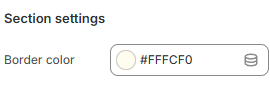
The image banner also includes a square-shaped border that appears when an image is hovered over. The color of
this border can be customized in the Section settings.
If the text is sitting too flush against the border of the section, you can increase the section padding to create more space between the section border and the text content. The video will not be affected by this setting.
The color of the overlay which on top of the video can be customized to make the text content more readable or enhance the visual appeal of the section.
Once you are satisfied with the changes, save your draft by clicking on the save button in the right top corner or pressing CTRL S (on Windows) or Command S (on Mac).
Adding Sections
To add a section to your store follow the instructions below:
- Open your store's admin panel.
- Choose the theme you want to customize and click on the customize button on the right-hand side.
- In the sidebar choose whether you want to add a section to the header, footer, or the main template.
- Inside your chosen part of the page, click on the Add section button.
- Use the pop-up menu to either search for a specific section by typing the name of the section in the search bar or peruse the available section to choose the one fitting your needs.
Available Sections
Nebula uses sections and blocks to make your dream store come true quicker and easier. Sections are layout elements consisting of smaller, reusable and modular blocks.
Nebula theme currently offers the following sections.
- Multirow
- Featured collection
- Rich text
- Image banner
- Diamond gallery
- Multimedia grid
- Multicolumn
- Collapsible content
- Revealing image multirow
- Email signup
- Video
- Blog posts
- Custom liquid
- Page
- Lookbook gallery
- Accordion gallery
- Collection grid
- Before/After slider
- Collection collage
- Contact form with map
- Contact form without map
- Countdown timer banner
- Media with text
- Image marquee
- Text marquee
- Scrolling heading (banner)
- Shop the Look
- Slideshow banner
- Video banner
- Testimonials/Press
- Breadcrumbs
- Recently viewed products
- Video sliding overlay
- Opening hours modal
Additional functionalities include:
Multirow
Image and text displayed in multiple rows. To open the Multirow settings, click on the Multirow section in the sidebar or inside the preview.
Note: if you want to open the section settings by clicking directly on the section, make sure the
inspector is activated. The icon will be colored blue when the inspector is active.
You can order the sections inside your template by using the drag and drop handles ⋮⋮. You can also order the blocks inside this function using the drag and drop handles ⋮⋮.
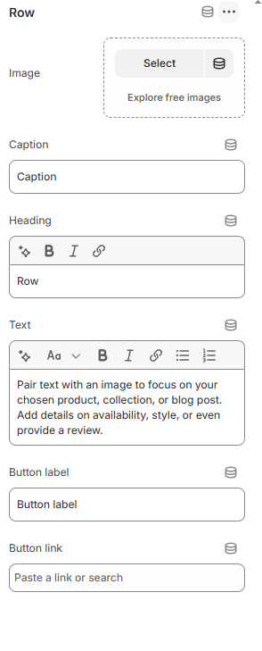
Images in this section have a 3D tilt effect. The number of rows can be changed to individual needs. The rows can either consist of interchanging text and media or have the media be aligned either to the left or the right.
Other options include adjustable image height and width, heading size, button and text style, as well as content alignment for desktop.
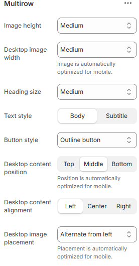
Each row includes the options to choose an individual heading, image and accompanying text. Buttons can be disabled by removing the button label. Each button also includes the possibility to add a link referring to either a page in your store or an external website.
Once you are satisfied with the changes, save your draft by clicking on the save button in the right top corner or pressing CTRL S (on Windows) or Command S (on Mac).
Multicolumn
A series of columns containing a header and text. To open the Multicolumn settings, click on the Multicolumn section in the sidebar or inside the preview.
Note: if you want to open the section settings by clicking directly on the section, make sure the
inspector is activated. The icon will be colored blue when the inspector is active.
You can order the sections inside your template by using the drag and drop handles ⋮⋮. You can also order the blocks inside this function using the drag and drop handles ⋮⋮.
Available options are: number of columns on desktop and mobile. The possible number of columns displayed in one row on desktop range from one to six and for mobile there is an option to display either one or two columns. To display more columns on mobile, you can also enable swipe on mobile. This option is turned off by default. There is a possibility to add an image to any column (one image per column).
Finally, you can optionally add a button at the bottom of the multicolumn section. This button is, however, only linked to pages inside your online store.
Once you are satisfied with the changes, save your draft by clicking on the save button in the right top corner or pressing CTRL S (on Windows) or Command S (on Mac).
Featured collection
Choose one of your collections or a selection of up to fifty products to be highlighted with the featured collection section. To open the Featured collection settings, click on the Featured collection section in the sidebar or inside the preview. You can order the sections inside your template by using the drag and drop handles ⋮⋮.
Note: if you want to open the section settings by clicking directly on the section, make sure the
inspector is activated. The icon will be colored blue when the inspector is active.
If you want to display a collection, toggle the Show collection setting. When this setting is disabled, a group of chosen products will be shown instead.
Choose a heading describing your collection, change its size to fit your shop and optionally add a description or enable the option Show collection description from the admin. You can adjust the style of the description choosing between three options: Body (this settings offers a style that aligns with other simple text elements throughout the website), Subtitle (slightly larger font size) and Uppercase, which transforms the entire text into uppercase. Further modifications available to the featured collection are Maximum products to show, if the number of products in the collection is larger than the set maximum number of products you'd like to be shown, you can enable a button to redirect the customer to the page containing the entire collection. Alternately, you can enable a carousel option on desktop.
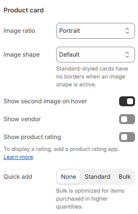
If you'd like your cards to be uniform, we recommend using the Product card settings. Within these settings, use the Image ratio setting and choose either Portrait or Square to display the product images in a uniform size.
Make sure that the number of products is larger than the number of columns to ensure that the carousel is displayed.
To learn more about collections and how to create them, please refer to the following manual.Once you are satisfied with the changes, save your draft by clicking on the save button in the right top corner or pressing CTRL S (on Windows) or Command S (on Mac).
Rich text
The rich text section consists of an optional heading with a heading size setting. You can change the heading text by removing the default content and replacing it with your own text. To open the settings for this section, click on the Rich text section in the sidebar or inside the preview. To edit the blocks, perform the same action by clicking directly on the block you wish to edit.
Note: if you want to open the section settings by clicking directly on the section, make sure the
inspector is activated. The icon will be colored blue when the inspector is active.
You can order the sections inside your template by using the drag and drop handles ⋮⋮. You can also order the blocks inside this function using the drag and drop handles ⋮⋮.
You can also remove, hide or duplicate each available block by clicking on the block you want to edit (Heading, Text or Buttons) and click on the plus-icon to duplicate the block, eye-icon to hide or display the icon or trash-icon to remove the block altogether. The removed block will still be available to be added to your section again whenever you wish to do so.
Once you are satisfied with the changes, save your draft by clicking on the save button in the right top corner or pressing CTRL S (on Windows) or Command S (on Mac).
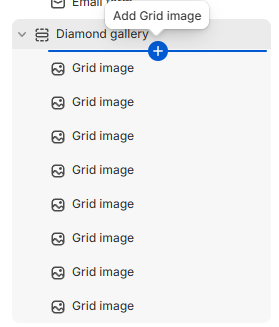
Diamond gallery
The diamond gallery section is a great way to attract potential customers trough visual content. To open the Diamond gallery settings, click on the Diamond gallery section in the sidebar or inside the preview.
Note: if you want to open the section settings by clicking directly on the section, make sure the
inspector is activated. The icon will be colored blue when the inspector is active.
You can order the sections inside your template by using the drag and drop handles ⋮⋮. You can also order the blocks inside this function using the drag and drop handles ⋮⋮.
Add blocks in this section by hovering under the Diamond gallery section in the sidebar and click on the blue plus-icon that will appear.
Choose a section heading and adjust its size to your preference.
Enable or disable links on images by toggling the Enable links on images setting. Disable this setting if you want the Diamond gallery section to solely be a gallery without redirecting customers to specific pages.
Enable or disable and customize the overlay color which will appear when an image is hovered over.
Once you are satisfied with the changes, save your draft by clicking on the save button in the right top corner or pressing CTRL S (on Windows) or Command S (on Mac).
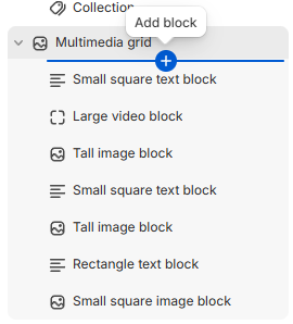
Multimedia gallery
To open the Multimedia grid settings, click on the Multimedia grid section in the sidebar or inside the preview.
Note: if you want to open the section settings by clicking directly on the section, make sure the
inspector is activated. The icon will be colored blue when the inspector is active.
You can order the sections inside your template by using the drag and drop handles ⋮⋮. You can also order the blocks inside this function using the drag and drop handles ⋮⋮.
Add blocks in this section by hovering under the Multimedia grid section in the sidebar and click on the blue plus-icon that will appear.
Choose a section heading and adjust its size to your preference.
You can choose between the following blocks: Small text block, Small image block,
Rectangle text block, Rectangle image block, Rectangle video block, Large text
block, Large image block, Large video block, Tall text block, Tall image
block, Tall video block, Large text block, Large image block, Large
video block, Collection, and Product.
Add any number of blocks, combining and arranging them in an order that suits your preference. Rearrange the blocks using drag and drop handles ⋮⋮.
The text blocks (all sizes) offer the possibility to change the background color. You can also choose between one of the available color schemes or create a new color scheme .
Once you are satisfied with the changes, save your draft by clicking on the save button in the right top corner or pressing CTRL S (on Windows) or Command S (on Mac).
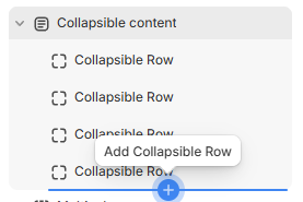
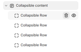
Collapsible content
Can be used as an FAQ section or to describe features of a product. Can be combined with an image. To open the Collapsible content settings, click on the Collapsible content section in the sidebar or inside the preview.
Note: if you want to open the section settings by clicking directly on the section, make sure the
inspector is activated. The icon will be colored blue when the inspector is active.
You can order the sections inside your template by using the drag and drop handles ⋮⋮. You can also order the blocks inside this function using the drag and drop handles ⋮⋮.
Image is optional and can be displayed either first or second both on mobile and desktop. To open the settings of this section click on the section in the sidebar menu or click on the section inside the editor preview. When the image is displayed first it will be displayed on the left-hand side on desktop and when it is displayed second, it will be displayed on the right-hand side. On mobile the image will be on top when it is set to be displayed first and on the bottom of the section when it is set to be displayed second. This section includes a gradient in the background. You can customize the colors of the gradient inside the section settings. If you prefer to have no gradient, remove the preset colors leaving the gradient colors transparent.
To add a collapsible row hover over the section in the sidebar and click on the blue plus-icon. To remove a collapsible row, hover over the block you want to remove in the sidebar and click on the trash-icon. Alternately, you can use the eye-icon to hide the block.
To edit the blocks click on the block you want to edit in the sidebar. You can customize the content that will be displayed when to row is expanded (Row content), the heading and also optionally add an icon in front of the Heading.
Once you are satisfied with the changes, save your draft by clicking on the save button in the right top corner or pressing CTRL S (on Windows) or Command S (on Mac).
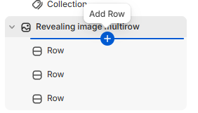
Revealing image multirow
To open the Reveal image rows settings, click on the Reveal image rows section in the sidebar or inside the preview.
Note: if you want to open the section settings by clicking directly on the section, make sure the
inspector is activated. The icon will be colored blue when the inspector is active.
You can order the sections inside your template by using the drag and drop handles ⋮⋮. You can also order the blocks inside this function using the drag and drop handles ⋮⋮.
Select an image size, choosing between Small, Medium, and Large. Choose the content alignment. This setting affects the text inside the rows, aligning it either to the left, right or centering it.
Choose an image and write accompanying text for it. The block settings in this section support rich text, meaning that you can choose different text sizes, make the text italic, bold, include URLs and add lists.
To add a new row hover over the section in the sidebar and click on the blue plus-icon. To remove a row, hover over the block you want to remove in the sidebar and click on the trash-icon. Alternately, you can use the eye-icon to hide the block.
To edit the blocks click on the block you want to edit in the sidebar. You can customize the content that will be displayed when to row is expanded (Row content), the heading and also optionally add an icon in front of the Heading.
Once you are satisfied with the changes, save your draft by clicking on the save button in the right top corner or pressing CTRL S (on Windows) or Command S (on Mac).
Video
To open the Video settings, click on the Video section in the sidebar or inside the preview.
Note: if you want to open the section settings by clicking directly on the section, make sure the
inspector is activated. The icon will be colored blue when the inspector is active.
Choose the heading text and its size, or remove the heading by removing the default heading text in the sidebar settings. Enable Play video on loop if you wish the video to play repeatedly. You can either upload a video from your own device by selecting Shopify-hosted video. Click on Select and add videos using the popup modal menu. Alternately, you can upload a video from YouTube or Vimeo by pasting the video URL in the Or embed video from URL setting.
Don't forget to add a video description for customers who use assistive technology. This will increase your store's accessibility and positively impact your SEO score. You can order the sections inside your template by using the drag and drop handles ⋮⋮.
Once you are satisfied with the changes, save your draft by clicking on the save button in the right top corner or pressing CTRL S (on Windows) or Command S (on Mac).
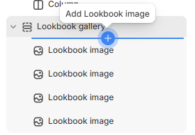
Lookbook gallery
To open the Lookbook gallery settings, click on the Lookbook gallery section in the sidebar or inside the preview.
Note: if you want to open the section settings by clicking directly on the section, make sure the
inspector is activated. The icon will be colored blue when the inspector is active.
Add blocks in this section by hovering under the Lookbook gallery section in the sidebar and click on the blue plus-icon that will appear.
You can order the sections inside your template by using the drag and drop handles ⋮⋮. You can also order the blocks by using the drag and drop handles ⋮⋮.
To remove any number of blocks, hover over the block you want to remove and click the trash-icon to remove it. You can also click on the eye-icon to hide the block. The removed block will still be available to be added to your section again whenever you wish to do so.
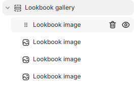
Edit the block by clicking on it. You can add an image, which will be displayed along with a clickable thumbnail. When the thumbnail is clicked on, the corresponding large image will slide onto the screen.
The mobile version in the editor will display a scrollbar beneath the thumbnails, this scrollbar will be less
visible and more visually pleasing and coherent when used on a real device. We recommend opening the preview
by clicking on the triple dot symbol ●●● next to the theme name in the editor's top bar.
 Once in the preview, you can share the preview and paste the copied link into the browser on your mobile
device. The link will be active for two days. Don't forget to enter your store's password if it is in
development.
Once in the preview, you can share the preview and paste the copied link into the browser on your mobile
device. The link will be active for two days. Don't forget to enter your store's password if it is in
development.
Once you are satisfied with the changes, save your draft by clicking on the save button in the right top corner or pressing CTRL S (on Windows) or Command S (on Mac).
Accordion gallery
To open the Accordion gallery settings, click on the Accordion gallery section in the sidebar or inside the preview.
Note: if you want to open the section settings by clicking directly on the section, make sure the
inspector is activated. The icon will be colored blue when the inspector is active.
Add blocks in this section by hovering under the Accordion gallery section in the sidebar and click on the blue plus-icon that will appear.
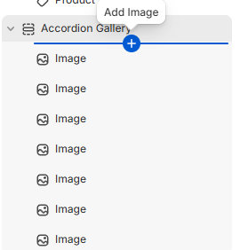
You can order the sections inside your template by using the drag and drop handles ⋮⋮. You can also order the blocks by using the drag and drop handles ⋮⋮.
To remove any number of blocks, hover over the block you want to remove and click the trash-icon to remove it. You can also click on the eye-icon to hide the block.
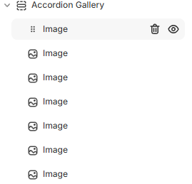
Edit the block by clicking on it. You can add an image, an overlay text that will appear when you hover over the block, a URL that will redirect the customer to either a page in your store or an external website, and an image that will be displayed in the gallery.
Enable or disable scroll on mobile in the section settings. When this setting is disabled the images will be displayed in a single column on mobile.
Note: When this section is not populated with images, only four placeholder images are displayed on screen.
Once you are satisfied with the changes, save your draft by clicking on the save button in the right top corner or pressing CTRL S (on Windows) or Command S (on Mac).
Collection grid
To open the Collection grid settings, click on the Collection grid section in the sidebar or inside the preview.
Note: if you want to open the section settings by clicking directly on the section, make sure the
inspector is activated. The icon will be colored blue when the inspector is active.
Add blocks in this section by hovering under the Collection grid section in the sidebar and click on the blue plus-icon that will appear.
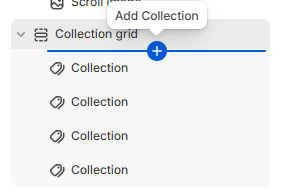
You can order the sections inside your template by using the drag and drop handles ⋮⋮. You can also order the blocks by using the drag and drop handles ⋮⋮.
To remove any number of blocks, hover over the block you want to remove and click the trash-icon to remove it. You can also click on the eye-icon to hide the block. The removed block will still be available to be added to your section again whenever you wish to do so.
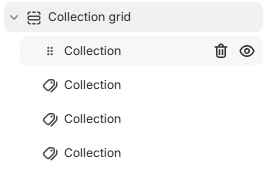
Edit the block by clicking on it. You can choose between all the collections available in your store to be displayed in this section.
Once you are satisfied with the changes, save your draft by clicking on the save button in the right top corner or pressing CTRL S (on Windows) or Command S (on Mac).
Recently viewed products
Automatically displays recently viewed products.
To open the Recently viewed products settings, click on the Recently viewed products section in the sidebar or inside the preview.
Note: if you want to open the section settings by clicking directly on the section, make sure the
inspector is activated. The icon will be colored blue when the inspector is active.
You can order the sections inside your template by using the drag and drop handles ⋮⋮.
Change the heading.
Once you are satisfied with the changes, save your draft by clicking on the save button in the right top corner or pressing CTRL S (on Windows) or Command S (on Mac).
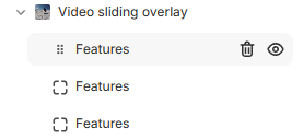
Video sliding overlay
To open the Video sliding overlay settings, click on the Video sliding overlay section in the sidebar or inside the preview.
Note: if you want to open the section settings by clicking directly on the section, make sure the
inspector is activated. The icon will be colored blue when the inspector is active.
You can order the sections inside your template by using the drag and drop handles ⋮⋮. You can also order the blocks by using the drag and drop handles ⋮⋮.
To remove any number of blocks, hover over the block you want to remove and click the trash-icon to remove it. You can also click on the eye-icon to hide the block.
Change the text content and colors:
- Choose a call to action text or a heading (Call to action text).
- Add a description (Description) that will be displayed underneath the heading.
- Choose a Primary color. This color will be used for the video overlay.
- Choose a Neutral color. This color will be displayed as an overlay when the overlay is toggled to display a list of features. The overlay is toggled when a user clicks on the button included in this section. Color primary is also used for the Call to action text and Description.
- Choose a color for the features' list using the Features text color setting.
- Change the button label.
- Choose a video that will be displayed in the background (Video).
Add up to four blocks containing a list of features that will be displayed when a user clicks on the button included in the section.
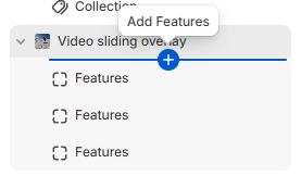
Choose a heading and write a list of corresponding features you want to highlight.
Once you are satisfied with the changes, save your draft by clicking on the save button in the right top corner or pressing CTRLS (on Windows) or Command S (on Mac).
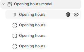
Opening hours modal
To open the Opening hours modal settings, click on the Opening hours modal section in the sidebar or inside the preview.
Note: if you want to open the section settings by clicking directly on the section, make sure the
inspector is activated. The icon will be colored blue when the inspector is active.
You can order the sections inside your template by using the drag and drop handles ⋮⋮. You can also order the blocks by using the drag and drop handles ⋮⋮.
To remove any number of blocks, hover over the block you want to remove and click the trash-icon to remove it. You can also click on the eye-icon to hide the block.
Change the text content and colors:
Choose a heading (Heading) and subheading (Subheading).
Choose a Background color and Text color.
Add blocks by hovering over the Opening hours modal section in the sidebar until a blue-colored plus-icon appears and click on it to add one opening hours block.
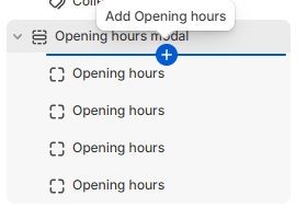
Write the opening hours you want to appear in one line.
Once you are satisfied with the changes, save your draft by clicking on the save button in the right top corner or pressing CTRLS (on Windows) or Command S (on Mac).
Before/After slider
Note: if you want to open the section settings by clicking directly on the section, make sure the
inspector is activated. The icon will be colored blue when the inspector is active.
You can order the sections inside your template by using the drag and drop handles ⋮⋮. You can also order the blocks by using the drag and drop handles ⋮⋮.
To remove any number of blocks, hover over the block you want to remove and click the trash-icon to remove it. You can also click on the eye-icon to hide the block. The removed block will still be available to be added to your section again whenever you wish to do so.
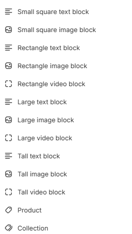
Supported blocks include: Heading, Fancy heading, Spacer, Divider, Regular text, Small text, List, Buttons, Icons, Text columns, Image, Feature range, and Liquid/HTML.
Fancy heading
Consists of a stylized text with background accompanied by regular heading text. Place the text you wish to have a background between square brackets []. The remaining non-stylized text does not have to be placed between brackets. Choose a heading color, optionally set a different color for the stylized part, choose a background color and custom font.
Spacer
Creates empty space between blocks. Drag and drop using the handles. Divider can be used to create space between blocks. Includes a line dividing the blocks between which the Divider is placed. Set a thickness, style and color. For more space between blocks above and below the divider, set padding bottom and top to your desired value using the range settings.
Feature range
Displays two ends of a range connected by a line with a dot indicating where a product can be placed within the range. Can be used for example to indicate the spiciness, sweetness, skin type, recommended age, fit etc. Choose a heading, the low end of the range, the high end of the range, set a color for the line and the dot. Choose the thickness of the line using the Line size setting and the size of the dot using the Dot size setting. Place the dot representing the product within the range using the Level setting. The higher the number, the more the dot is shifted towards the high end of the range.
Once you are satisfied with the changes, save your draft by clicking on the save button in the right top corner or pressing CTRL S (on Windows) or Command S (on Mac).
Collection collage
To open the Collection collage settings, click on the Collection collage section in the sidebar or inside the preview.
Note: if you want to open the section settings by clicking directly on the section, make sure the
inspector is activated. The icon will be colored blue when the inspector is active.
You can order the sections inside your template by using the drag and drop handles ⋮⋮.
Choose one image for each collection or product you want to include in the collage. You can add four images in total. Add a URL referring to the collection or product portrayed in each of the four collage quarters. Don't forget to add an alt-text to your images in the section settings. This text will be displayed when your images cannot be loaded and will help customers using assistive technology better navigate your website.
Once you are satisfied with the changes, save your draft by clicking on the save button in the right top corner or pressing CTRL S (on Windows) or Command S (on Mac).
Contact form with map
To open the Contact form with map settings, click on the Contact form with map section in the sidebar or inside the preview.
Note: if you want to open the section settings by clicking directly on the section, make sure the
inspector is activated. The icon will be colored blue when the inspector is active.
You can order the sections inside your template by using the drag and drop handles ⋮⋮.
To embed a map:
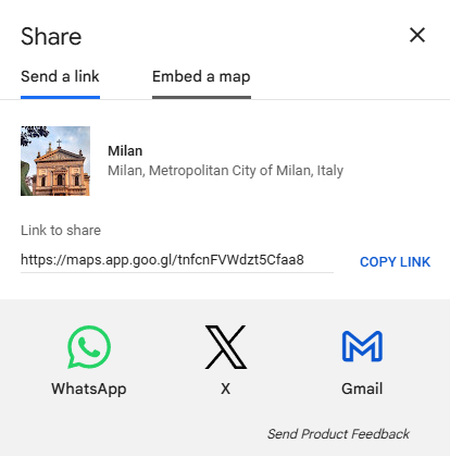
- Open Google Maps and search for the address you want to embed in your contact form.
- Click on the Share button.
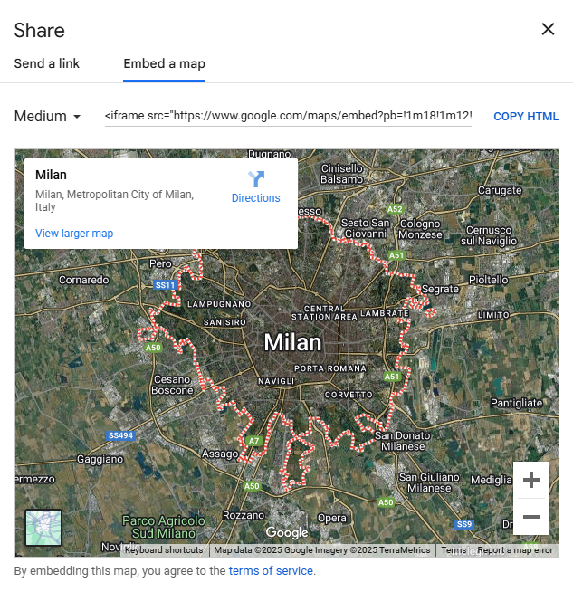
- Open Embed a map.
- Click on COPY HTML to copy the map.
- Go back to your store's admin panel.
- Click on Sales channels and open Online Store.
- Click on the Customize button next to Nebula theme.
- Navigate to the page to which you have added the Contact form with map section.
- Open the section settings.
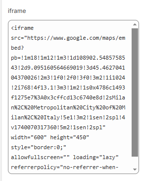
- Paste the copied HTML code in the iframe field.
Once you are satisfied with the changes, save your draft by clicking on the save button in the right top corner or pressing CTRL S (on Windows) or Command S (on Mac).
Countdown banner
To open the Countdown timer banner settings, click on the Countdown timer banner section in the sidebar or inside the preview.
Note: if you want to open the section settings by clicking directly on the section, make sure the
inspector is activated. The icon will be colored blue when the inspector is active.
You can order the sections inside your template by using the drag and drop handles ⋮⋮.
It is important to note that the preview may break during editing. Save your section settings in order to preview the section correctly.
Choose a heading and a call to action text. If you want to redirect your customers to a different page, add a link and a link label.
Set an end date using the following format: Dec 31, 2026 23:59:59. Change the units that will be displayed above the timer or leave the field(s) empty to not display them.
If you want to display a background image, toggle the Show background image setting and add select the image you want to be displayed in the background. Alternately, choose a color scheme to set a background color from the premade color schemes, edit one of the available color schemes or create a new scheme .
Optionally, select a page you want your customers to be redirected to and add a label upon which your customers can click to be redirected. Leave the label and url field empty if you don't want to link any pages to your countdown timer.
Once you are satisfied with the changes, save your draft by clicking on the save button in the right top corner or pressing CTRL S (on Windows) or Command S (on Mac).
Media with text
To open the Media with text settings, click on the Media with text section in the sidebar or inside the preview.
Note: if you want to open the section settings by clicking directly on the section, make sure the
inspector is activated. The icon will be colored blue when the inspector is active.
You can order the sections inside your template by using the drag and drop handles ⋮⋮.
You can combine either an image or a video with text. If no image is chosen, the video will be included in this section. Therefore, if you'd like to include a video, you need to ensure that the image setting remains blank.
You can enable or disable video looping by toggling the Enable video loop setting.
Set the image height to either adapt to the image ratio, or choose a Small, Medium or Large setting.
Align the text through the Desktop content alignment setting.
For the mobile version use the Mobile content alignment setting under the Mobile layout category.
Use the Desktop content position to position the media relative to the text. The Top setting aligns the media above the text, Middle aligns the media and text at the same height and Bottom aligns the media lower than the text.
You can overlap or space the media and text out using the Overlap setting.
The media has a 3D tilt effect, which can be disabled under the Animations category.
Once you are satisfied with the changes, save your draft by clicking on the save button in the right top corner or pressing CTRL S (on Windows) or Command S (on Mac).
Image marquee
To open the Image marquee settings, click on the Image marquee section in the sidebar or inside the preview.
Note: if you want to open the section settings by clicking directly on the section, make sure the
inspector is activated. The icon will be colored blue when the inspector is active.
You can order the sections inside your template by using the drag and drop handles ⋮⋮. You can also order the blocks by using the drag and drop handles ⋮⋮.
To remove any number of blocks, hover over the block you want to remove and click the trash-icon to remove it. You can also click on the eye-icon to hide the block. The removed block will still be available to be added to your section again whenever you wish to do so.
Choose the direction in which the marquee will scroll. You can choose between left-to-right or right-to-left.
Add your preferred number of images inside the marquee and adjust the animation speed as needed. The higher the number, the slower the animation. Enable or disable pausing the animation when you hover over it with your cursor. Show or hide the background color on your marquee, show or hide the transparent border on both the images and marquee itself. When the background color is hidden, there will be no visible transparent border on the marquee. Choose a one of the existing color schemes or create a new one. To add images, select the block you want to edit and add an image in the sidebar menu. If you are displaying products or collections, we recommend adding a URL referring to the displayed product or collection. Add an alt-text describing the image for improved accessibility.
Add an optional heading which will be displayed as a separator between the series of images.
Once you are satisfied with the changes, save your draft by clicking on the save button in the right top corner or pressing CTRL S (on Windows) or Command S (on Mac).
Text marquee
To open the Text marquee settings, click on the Text marquee section in the sidebar or inside the preview.
Note: if you want to open the section settings by clicking directly on the section, make sure the
inspector is activated. The icon will be colored blue when the inspector is active.
You can order the sections inside your template by using the drag and drop handles ⋮⋮. You can also order the blocks by using the drag and drop handles ⋮⋮.
To remove any number of blocks, hover over the block you want to remove and click the trash-icon to remove it. You can also click on the eye-icon to hide the block. The removed block will still be available to be added to your section again whenever you wish to do so.
Choose the direction in which the marquee will scroll. You can choose between left-to-right or right-to-left.
Add your preferred number of blocks inside the marquee and adjust the animation speed as needed. The higher the number, the slower the animation. Enable or disable pausing the animation when you hover over it with your cursor. Show or hide the background color on your marquee, show or hide the transparent border on the marquee. When the background color is hidden, there will be no visible transparent border on the marquee. Choose a one of the existing color schemes or create a new one. To add content to your blocks, select the block you want to edit and add write the text you want to include in the sidebar menu, you can choose the size and style of the text.
Add an optional separator which will be displayed between the series of blocks.
You can also rotate your marquee. When the marquee is rotated it may overflow the page, causing side scrolling. You can adjust the width of your rotated marquee to prevent this from happening.
Once you are satisfied with the changes, save your draft by clicking on the save button in the right top corner or pressing CTRL S (on Windows) or Command S (on Mac).
Scrolling heading (banner)
To open the Scrolling heading settings, click on the Scrolling heading section in the sidebar or inside the preview.
Note: if you want to open the section settings by clicking directly on the section, make sure the
inspector is activated. The icon will be colored blue when the inspector is active.
You can order the sections inside your template by using the drag and drop handles ⋮⋮. You can also order the blocks by using the drag and drop handles ⋮⋮.
To remove any number of blocks, hover over the block you want to remove and click the trash-icon to remove it. You can also click on the eye-icon to hide the block. The removed block will still be available to be added to your section again whenever you wish to do so.
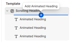
Add blocks in this section by hovering under the Scrolling Heading section in the sidebar and click on the blue plus-icon that will appear.
Choose a static heading and description, add an image and resize it to suit your preference. Change the section background.
Click on the block you want to edit. Change the animated heading text, color, and text-shadow color.
Once you are satisfied with the changes, save your draft by clicking on the save button in the right top corner or pressing CTRL S (on Windows) or Command S (on Mac).
Shop the Look
To open the Shop the Look settings, click on the Shop the Look section in the sidebar or inside the preview.
It is important to note that products may disappear during editing the settings. Save your customizations to display the section correctly.
Note: if you want to open the section settings by clicking directly on the section, make sure the
inspector is activated. The icon will be colored blue when the inspector is active.
You can order the sections inside your template by using the drag and drop handles ⋮⋮. You can also order the blocks by using the drag and drop handles ⋮⋮.
To remove any number of blocks, hover over the block you want to remove and click the trash-icon to remove it. You can also click on the eye-icon to hide the block. The removed block will still be available to be added to your section again whenever you wish to do so.
Add blocks in this section by hovering under the Shop the Look section in the sidebar and click on the blue plus-icon that will appear.
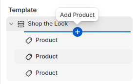
Click on the block you want to edit. Choose a product you want to include, set the position of the dot to align it with the corresponding product on the image (left-hand side).
Set a title and subtitle for both the section, as well as the card that appears on the mobile version.
Set a button label that will redirect your customers to the product page for both the desktop as well as the mobile version.
Customize the dot color (appears on top of the outfit image) as well as the navigation dot colors. The navigation dots appear below the products.
You can also choose a different color scheme, if you prefer. You can customize the color schemes inside the theme settings.
If you prefer not to include a (sub)title anywhere in this section, leave the corresponding field(s) empty.
Once you are satisfied with the changes, save your draft by clicking on the save button in the right top corner or pressing CTRL S (on Windows) or Command S (on Mac).
Testimonials / Press
Nebula offers a Testimonials section including client testimonials between blockquotes, accompanied by a picture and a Press section containing logos instead pictures. These sections can be used interchangeably depending on preference.
To open the Testimonials or Press settings, click on the Testimonials or Press section in the sidebar or inside the preview.
Note: if you want to open the section settings by clicking directly on the section, make sure the
inspector is activated. The icon will be colored blue when the inspector is active.
You can order the sections inside your template by using the drag and drop handles ⋮⋮. You can also order the blocks by using the drag and drop handles ⋮⋮.
To remove any number of blocks, hover over the block you want to remove and click the trash-icon to remove it. You can also click on the eye-icon to hide the block. The removed block will still be available to be added to your section again whenever you wish to do so.
Add blocks in this section by hovering under the Testimonials or Press section in the sidebar and click on the blue plus-icon that will appear.
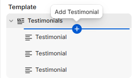
Click on the block you want to edit. Choose an image, write the quote or testimonial you want to include in the *Quote* text area, and add the author of the testimonial. You can leave the field for the author empty to hide it.
Once you are satisfied with the changes, save your draft by clicking on the save button in the right top corner or pressing CTRL S (on Windows) or Command S (on Mac).
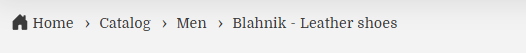
Breadcrumbs
Breadcrumbs are usually placed in the header group and display the hierarchy of pages the user is currently visiting.
Example:
Note: if you want to open the section settings by clicking directly on the section, make sure the
inspector is activated. The icon will be colored blue when the inspector is active.
You can order the sections inside your template by using the drag and drop handles ⋮⋮. You can also order the blocks by using the drag and drop handles ⋮⋮.
The home icon shown in the example above can be hidden by toggling the Use the home icon next to the Home link in the breadcrumb checkbox. Choose a delimeter of your liking. The delimeter will be displayed between the pages.
Choose an optional background color for this section and adjust the breadcrumb and accent color as needed. Current page can be displayed in an accent color by toggling the Enable accent color for last link in breadcrumb checkbox.
Once you are satisfied with the changes, save your draft by clicking on the save button in the right top corner or pressing CTRL S (on Windows) or Command S (on Mac).
Gift wrapping
You can add the option for an order to be wrapped as a gift inside your cart.
In order to set up gift wrapping, follow the steps below:
- Open your store's admin page
- In the sidebar menu open Products
- Click on the Add Product button at the top of the page
- Name your product, set a price if you want to charge for gift wrapping and optionally add an image.
- Save the product.
- In the sidebar menu open Content and click on Menus in the dropdown menu.
- Click on the Create menu button at the top of the page.
- Name your menu Gift wrapping. It is important to use this name as the code responsible for the gift wrapping option looks for the handle.
- Click on Add menu item and add the link to your gift wrapping product.
- Save the menu.
- In the sidebar menu click on Online store and click on the Customize button next to the theme you want to customize.
- Inside the customizer open the Cart page
- Click on Add block beneath the Items section.
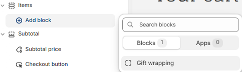
- Add a text informing your customers about the optional gift wrapping. Enable or disable the possibility of adding a custom message to the gift. If you've enabled the additional custom message, add a label for it.
Once you are satisfied with the changes, save your draft by clicking on the save button in the right top corner or pressing CTRL S (on Windows) or Command S (on Mac).
Size chart
Note: if you want to open the section settings by clicking directly on the section, make sure the
inspector is activated. The icon will be colored blue when the inspector is active.
In order to set up a single size chart, follow the steps below:
- Create a page for the size chart you want to include in your store.
- Open the theme customizer.
- Open the product template you want to edit.
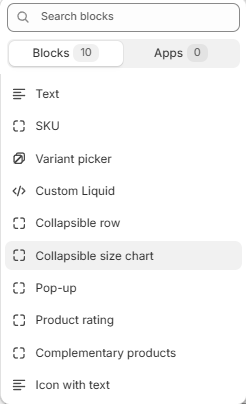
- Hover underneath the Product information section and click on the Add block button that
will appear.
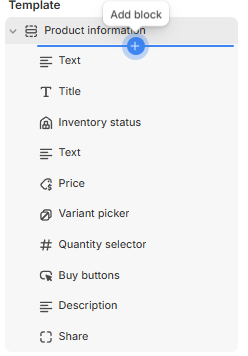
- Choose the Collapsible size chart block in the menu.
- Choose a heading, optionally show the icon by toggling the Show icon checkbox and select the sizing page.
If you want to include multiple size charts:
- Create a separate page for each size chart you want to include in your store.
- Open Settings
- Inside your store's settings, click on Custom data in the sidebar.
- Click on Products.
- Click on the Add definition button.
- Choose a name for the metafield. For example: Size chart.
- Set Page as the type of your metafield definition.
- Save the metafield and navigate to the products you want to add a size chart to.
- In the product editor, scroll down to the Product metafields.
- Choose the page containing the size chart you want to include on the product page.
- Open the theme customizer.
- Open the product template you want to edit.
- Hover underneath the Product information section and click on the Add block button that will appear.
- Choose the Collapsible size chart block in the menu.
- Choose a heading, optionally show the icon by toggling the Show icon checkbox and click on the
dynamic data icon next to the Select button.
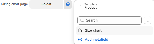
- Choose the size chart metafield you have created in the previous steps.
Note: If you only want to include the size chart block in some of your products, create a separate product template for product with and without the size chart.
Once you are satisfied with the changes, save your draft by clicking on the save button in the right top corner or pressing CTRL S (on Windows) or Command S (on Mac).
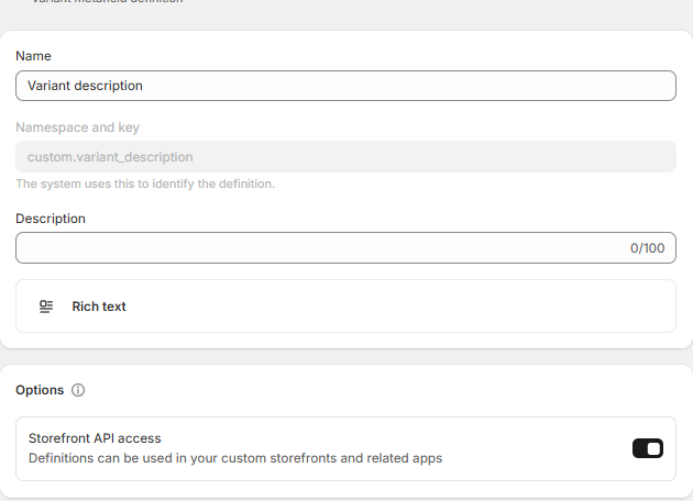
Dynamic variant description
Note: if you want to open the section settings by clicking directly on the section, make sure the
inspector is activated. The icon will be colored blue when the inspector is active.
Nebula offers the possibility of adding descriptions for specific product variants. The variant description will be displayed when the corresponding variant is selected.
In order to set up a dynamic variant description, follow the steps below:
- Open Settings
- Inside your store's settings, click on Custom data in the sidebar.
- Click on Variants.
- Click on the Add definition button.
- Choose a name for the metafield. For example: Variant description.
- Write down or remember the namespace and key.
- Set Rich text or Page as the type of your metafield definition.
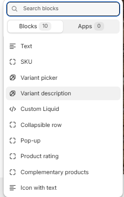
- Open your theme editor.
- Open the theme customizer.
- Open the product template you want to edit.
- Hover underneath the Product information section and click on the Add block button that
will appear.
- Choose the Variant description block in the menu.
- Insert the name of the variant description metafield you have created, the namespace and key. Choose an optional fallback source which will be displayed when the metafield is empty.
- Leave the theme editor.
- In your store's admin open Products in the sidebar menu.
- Choose a product whose variants you want to edit.
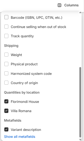
- Click on the variant you want to add a description and write a description.
- Alternately, select multiple variants and utilize the Bulk edit functionality. Ensure that the
metafield is displayed in your editor by clicking on Columns in the top bar and toggling the
variant description metafield in the dropdown menu.
Note: If you only want to include the variant description block in some of your products, create a separate product template for product with and without the variant description.
Once you are satisfied with the changes, save your draft by clicking on the save button in the right top corner or pressing CTRL S (on Windows) or Command S (on Mac).
General Settings
To access the theme settings:
- Log into your store admin panel on Shopify.
- Open Online Store in the Sales channel dropdown menu in the sidebar.
- Click on the Customize button next to Nebula theme.
- Open theme settings by clicking on the cogwheel icon in the sidebar.
Glass Effect
Nebula contains glass-like accents, which are largely customizable.
Set the blur effect. The higher the number the less visible the elements behind glass panels are. Increase or decrease the opacity. The lower the number the more see-through the glass-panels are. Decreasing these values too much can cause text to become unreadable, be careful when changing these settings. When decreasing one value, consider increasing the other.
Once you are satisfied with the changes, save your draft by clicking on the save button in the right top corner or pressing CTRL S (on Windows) or Command S (on Mac).
Logo
Upload your store logo and adjust its width on desktop. The logo will be displayed in the top bar menu. Add a favicon image. This image will be displayed in the browser tab.
Once you are satisfied with the changes, save your draft by clicking on the save button in the right top corner or pressing CTRL S (on Windows) or Command S (on Mac).
Colors
Modify one of the preset color themes or create your own custom theme. Scheme 1 is applied by default. To edit an existing color scheme, click the color swatch to change the following content type colors:
- Background
- Background gradient
- Text
- Solid button background
- Solid button label
- Outline button
- Secondary button background
- Shadow
Once you are satisfied with the changes, save your draft by clicking on the save button in the right top corner or pressing CTRL S (on Windows) or Command S (on Mac).
Typography
Change the font of the headings and body. Adjust the font size scale as needed.
Once you are satisfied with the changes, save your draft by clicking on the save button in the right top corner or pressing CTRL S (on Windows) or Command S (on Mac).
Layout
Change the width of the page on desktop using the Page width setting. Add or remove space between sections using the Space between template sections setting.
Add or remove space between elements with a grid layout. These elements consist of multiple columns and/or rows.
Once you are satisfied with the changes, save your draft by clicking on the save button in the right top corner or pressing CTRL S (on Windows) or Command S (on Mac).
Animations
Toggle the reveal sections on scroll setting to enable/disable the default scroll animation.
Select a hover effect or turn it off by selecting None.
Once you are satisfied with the changes, save your draft by clicking on the save button in the right top corner or pressing CTRL S (on Windows) or Command S (on Mac).
Buttons
Edit the border thickness, opacity and corner radius. The opacity defines how see-through the border is. The lower the value, the more see-through. The corner radius defines how rounded the corners of the button are.
Once you are satisfied with the changes, save your draft by clicking on the save button in the right top corner or pressing CTRL S (on Windows) or Command S (on Mac).
Variant pills
Learn more about variants and how to set them up here.
Change the variant pills' border thickness, opacity and corner radius. The opacity defines how see-through the border is. The lower the value, the more see-through. The corner radius defines how rounded the corners of the variant pill are.
Set the shadow's opacity, horizontal and vertical offset and blur.
Once you are satisfied with the changes, save your draft by clicking on the save button in the right top corner or pressing CTRL S (on Windows) or Command S (on Mac).
Inputs
Change the input fields' border thickness, opacity and corner radius. The opacity defines how see-through the border is. The lower the value, the more see-through. The corner radius defines how rounded the corners of the inputs are.
Set the shadow's opacity, horizontal and vertical offset and blur.
Once you are satisfied with the changes, save your draft by clicking on the save button in the right top corner or pressing CTRL S (on Windows) or Command S (on Mac).
Product cards
Choose between the Standard style of product cards with a glass-inspired background or the Card style with a solid background. Choose between the available color schemes or create your own. Set the text alignment.
Change the image padding to display more background behind the product images or set it to 0 to set the border flush against the image.
Change the cards' border thickness, opacity and corner radius. The opacity defines how see-through the border is. The lower the value, the more see-through. The corner radius defines how rounded the corners of the product cards are.
Set the shadow's opacity, horizontal and vertical offset and blur.
Once you are satisfied with the changes, save your draft by clicking on the save button in the right top corner or pressing CTRL S (on Windows) or Command S (on Mac).
Product cards swatches
If you want to display swatches on your collections, enable the product card swatches in this setting and disable the Show second image on hover in all your collections.
Enable or disable the Lazy load variant images settings. When this setting is enabled the images will initially load slower but the swatches will be more responsive. When this setting is disabled the collection will load faster, but the variant images will load only when needed. It is generally recommended to enable lazy loading for smaller inventories.
Choose the name of the variant you want to show the swatches. This name has to be equivalent to the name displayed in the product editor.
Choose the swatch shape and size.
Once you are satisfied with the changes, save your draft by clicking on the save button in the right top corner or pressing CTRL S (on Windows) or Command S (on Mac).
Collection cards
Choose between the Standard style of product cards with a glass-inspired background or the Card style with a solid background. Choose between the available color schemes or create your own . Set the text alignment.
Change the image padding to display more background behind the product images or set it to 0 to set the border flush against the image.
Change the cards' border thickness, opacity and corner radius. The opacity defines how see-through the border is. The lower the value, the more see-through. The corner radius defines how rounded the corners of the collection cards are.
Set the shadow's opacity, horizontal and vertical offset and blur.
Once you are satisfied with the changes, save your draft by clicking on the save button in the right top corner or pressing CTRL S (on Windows) or Command S (on Mac).
Blog cards
Choose between the Standard style of blog cards with a glass-inspired background or the Card style with a solid background. Choose between the available color schemes or create your own . Set the text alignment.
Change the image padding to display more background behind the product images or set it to 0 to set the border flush against the image.
Change the cards' border thickness, opacity and corner radius. The opacity defines how see-through the border is. The lower the value, the more see-through. The corner radius defines how rounded the corners of the blog cards are.
Set the shadow's opacity, horizontal and vertical offset and blur.
Once you are satisfied with the changes, save your draft by clicking on the save button in the right top corner or pressing CTRL S (on Windows) or Command S (on Mac).
Content containers
Change the cards' border thickness, opacity and corner radius. The opacity defines how see-through the border is. The lower the value, the more see-through. The corner radius defines how rounded the corners of the content containers are.
Set the shadow's opacity, horizontal and vertical offset and blur.
Once you are satisfied with the changes, save your draft by clicking on the save button in the right top corner or pressing CTRL S (on Windows) or Command S (on Mac).
Media
Change the dropdowns' and pop-ups' border thickness, opacity and corner radius. The opacity defines how see-through the border is. The lower the value, the more see-through. The corner radius defines how rounded the corners of the dropdowns and pop-ups are.
Set the shadow's opacity, horizontal and vertical offset and blur.
Once you are satisfied with the changes, save your draft by clicking on the save button in the right top corner or pressing CTRL S (on Windows) or Command S (on Mac).
Drawers
Change the drawers' border thickness, opacity and corner radius. The opacity defines how see-through the border is. The lower the value, the more see-through. The corner radius defines how rounded the corners of the drawer are.
Set the shadow's opacity, horizontal and vertical offset and blur.
Once you are satisfied with the changes, save your draft by clicking on the save button in the right top corner or pressing CTRL S (on Windows) or Command S (on Mac).
Custom badges
You can add up to three additional custom badges to your store.
Before customizing the badges in the theme settings, you will need to add four metafields.
To add metafields, follow the steps below:
- In your store's admin, open Settings.
- Once inside the settings page, open Custom data and click on Products.
- Click the Add definition button.
- Name the metafield "Custom Badge 1".
- Click on Select type and choose True or false from the dropdown menu.
Repeat the same steps for Custom Badge 2 and Custom Badge 3, changing the name to "Custom Badge 2" and "Custom Badge 3 " respectively. Use the same names as in this documentation.
To set the Custom Dynamic Badge follow the same steps. Set the type to File instead of True or false. Under Validations choose the setting Accept specific file types and choose Images.
Set the display options ordering the badges in a reverse or normal order, stacking them or placing them in one line and adjust the gap between the badges.
Enable or disable each of the badges on either the product cards, the product page or show it on both.
Choose the type for each badge and their position on the cards as well as the text content and color scheme.
If you want to use an image as a badge, use preferably a PNG file for best effect. And adjust the size of the image badge.
If you set one of the badges to a Dynamic Image Badge type, you can add the image in the product metafields.
To add a custom badge to your products, navigate to the product you want to add a badge to, and set the badge metafield value to true in the metafield settings for the custom badges of type Text Badge and Image Badge. For the Dynamic Custom Badge upload the file you want to be displayed as a badge.
Once you are satisfied with the changes, save your draft by clicking on the save button in the right top corner or pressing CTRL S (on Windows) or Command S (on Mac).
Badges
Adjust the badge position on the cards and the corner radius. The corner radius defines how rounded the corners of the badges are. Choose one of the preset color schemes or create your own .
Once you are satisfied with the changes, save your draft by clicking on the save button in the right top corner or pressing CTRL S (on Windows) or Command S (on Mac).
Brand information
Adds a brand description to your store's footer (bottom of the page). Write a headline and description. Add an accompanying image. Adjust the image width.
Once you are satisfied with the changes, save your draft by clicking on the save button in the right top corner or pressing CTRL S (on Windows) or Command S (on Mac).
Social media
Add your links to your social media accounts to be displayed in your store.
Once you are satisfied with the changes, save your draft by clicking on the save button in the right top corner or pressing CTRL S (on Windows) or Command S (on Mac).
Search behavior
Enable or disable search suggestions (enabled by default). Display or hide the product vendor in the search suggestions (disabled by default). Display or hide the product price in the search suggestions (disabled by default).
Once you are satisfied with the changes, save your draft by clicking on the save button in the right top corner or pressing CTRL S (on Windows) or Command S (on Mac).
Currency format
Show or hide currency codes in front of the product prices
Once you are satisfied with the changes, save your draft by clicking on the save button in the right top corner or pressing CTRL S (on Windows) or Command S (on Mac).
Cart
Choose the cart type, show or hide the product vendors, enable or disable cart note. Choose a collection that will be displayed when your cart is empty. Select a cart color scheme.
Once you are satisfied with the changes, save your draft by clicking on the save button in the right top corner or pressing CTRL S (on Windows) or Command S (on Mac).
Cart drawer recommendations upsell
This theme offers the possibility of including product recommendations in your cart. In order to set the recommendations up, set your cart type to drawer in the Theme settings. For more information see Cart. Toggle the Enable cart drawer recommendations checkbox.
Choose a background color for the recommendation section, set a heading, heading color, and font size and weight. Adjust the media width to increase or decrease the size of the recommended product images.
Choose between automated recommendations (Auto Recommendations) or complementary products (Complementary). Complementary products can be set in the Shopify Search & Discovery app. Set a number of products to be shown.
Set a number of products which will be the pool of products from which the code will select recommendations to display in the cart. A higher number may cause slightly slower load times. Optionally change the recommendation settings.
Once you are satisfied with the changes, save your draft by clicking on the save button in the right top corner or pressing CTRL S (on Windows) or Command S (on Mac).
Custom CSS
Add your own custom CSS to style your entire store. Note: there is a limit of 1500 characters. If you wish to add more CSS to your store, we recommend editing the code.
Theme style
Changing your theme's style will affect both the settings and look and feel of your store. Choose one of the preset theme styles.